Putting the brand back together
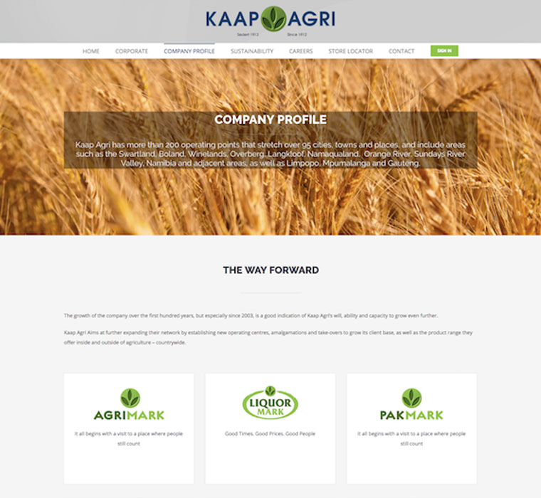
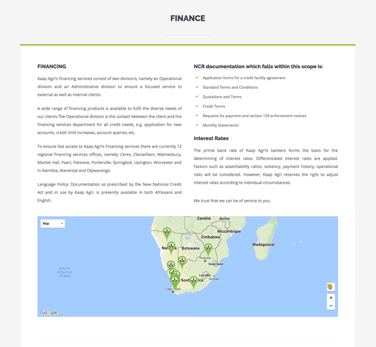
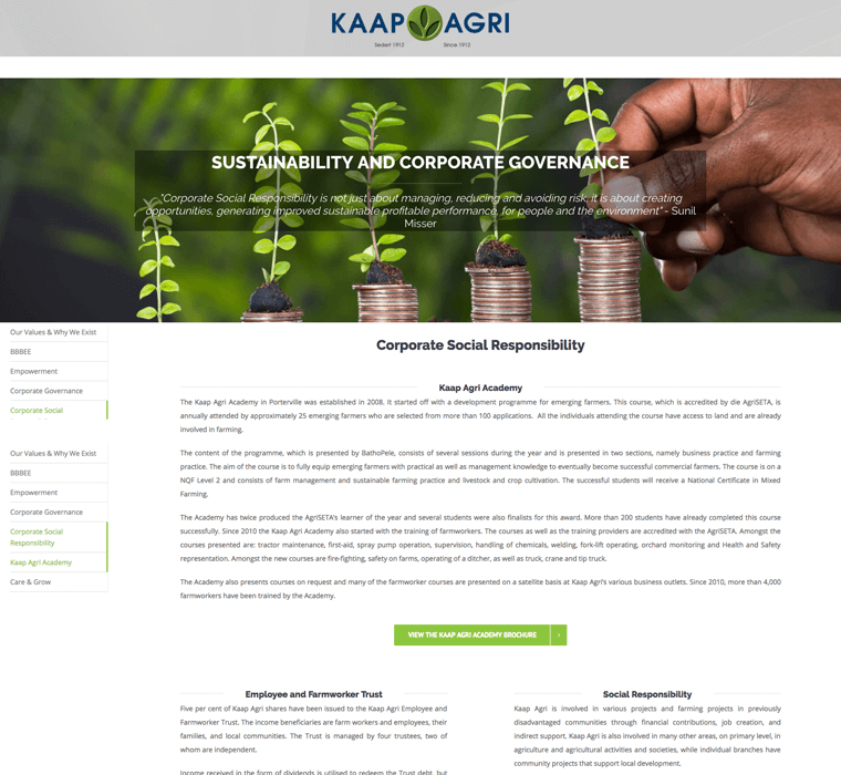
Kaap Agri is a JSE-listed company and one of the largest agriculture products and services providers in South Africa. Like many large companies that deal with a wide range of products and services, it began to face the issue of fragmentation in its brand, style and user experience across its different divisions. This is where The Website Engineer came in – immediately addressing this issue on both the front end and back end, creating easy access to all divisional websites from Kaap Agri’s main site, and ensuring a consistent look & feel and user experience across all its sites.
Putting Productivity First
We created a modern design that’s both instantly recognisable and easy to use.
An intuitive user experience makes for happy customers
A good website helps visitors and customers get to where they’re going quickly and easily. Whether Kaap Agri’s customers need to download reports, locate stores, or read the latest announcement, getting where you need to go is simple with The Website Engineer’s intuitive, consistent design. Most importantly, every website we build is mobile-ready and just as simple to use whether you’re out on the farm with your smartphone or sitting at your desk.
Building a system that Kaap Agri’s own staff can easily maintain
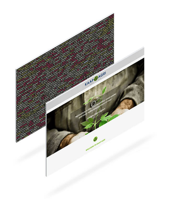
Like any large company, Kaap Agri needs to communicate regularly with its customers through a variety of channels, from reports and newsletters to press releases and published articles. This required a cloud-based system that made it easy for staff across all of Kaap Agri’s divisions to upload and download files and organise content simply and quickly, and when they told us what they needed, we knew exactly what to build them. Kaap Agri’s new website comes complete with a custom back-end, which, using simple input fields, allows staff to automatically generate the content pages they need without needed any technical skill or training.
![The Website Engineer [Work] Logo](https://work.thewebsiteengineer.com/wp-content/uploads/sites/3/2017/11/The-Website-Engineer-Logo.png)
